🧱 Build Segment Landing Pages That Convert (Layout, Copy, and CTA)
🧱 Build Segment Landing Pages That Convert (Layout, Copy, and CTA)
A landing page has one job:
make the next step feel safe.
But most pages try to do too much. They talk to everyone. They offer five things. They hide proof. They confuse the brain.
And confused brains don’t buy.
This is where market segmentation saves the day. When we build one landing page per market segmentation slice, we speak to one clear target audience. We mirror real consumer behavior. We build a sharper buyer persona. We create buyer clarity—fast.
Pick one market segmentation slice. Build one page with one promise and one CTA. Put proof by the button. Add slice FAQs. Make it mobile-first. Use the wireframes and swipe copy below.
💡 Why market segmentation landing pages convert better
A segmented page feels like it was made “for us.”
That feeling matters because it hits:
survival (“This helps me avoid pain.”)
belonging (“This is for people like us.”)
status (“We’re making a smart move.”)
certainty (“I know what to do next.”)
Market segmentation makes this possible by:
reducing noise
clarifying the promise
matching the offer to the stage
using real consumer behavior signals
making the target audience easy to aim at
🧭 The “one slice, one page” rule for market segmentation
Here’s the core rule:
One market segmentation slice = one landing page.
Why? Because:
Each slice has a different pain
Each slice needs different proof
Each slice has different objections
Each slice wants a different “next step”
One page cannot be perfect for five slices.
So we make one page per slice.
That’s how small businesses compete.
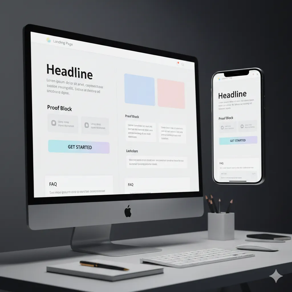
🧱 The wireframe that works for market segmentation landing pages
Use this order. Keep it simple. Keep it scannable.
🧩 Above the fold (market segmentation)
Headline (slice promise)
Subhead (short path)
Primary CTA (one button)
Proof snippet (right by CTA)
🧩 Middle (market segmentation)
3-step path with time tags
Proof stack (like-me story + short quotes)
“For / Not-for” box
🧩 Bottom (market segmentation)
FAQs by slice
Second CTA row
Footer CTA + complimentary ebook
This layout matches how brains decide:
safe → simple → proof → action.
🪧 Headline formulas that fit market segmentation slices
Headlines must match the slice’s pain and dream.
💥 Pain-first headline (market segmentation)
“Stop [pain] and get [result] in [time]—without [hated thing].”
🌈 Dream-first headline (market segmentation)
“Get [result] in [time]—even if [fear].”
📣 Proof-first headline (market segmentation)
“[Role] got [result] in [time]. See the 3 steps.”
Pick one. Test later. Keep it clear.
✍️ Subhead template for market segmentation pages
Subhead should feel calm and certain.
Use this:
“Simple steps. Fast first win. We do this with you.”
Or this:
“Three steps. Clear next move. First win in 48 hours.”
Subhead is where buyer clarity lives.
🔘 CTA rules for market segmentation landing pages
Each slice gets one primary CTA.
Good CTAs feel safe:
“See how it works”
“Start your 7-day plan”
“Get the complimentary guide”
“Start the trial”
“Book a quick call”
Important: CTA must match stage:
cold slice → guide/checklist
warm slice → trial/demo
hot slice → book/buy
This is how consumer behavior guides action.
✅ Proof placement for market segmentation pages (trust at the click)
Proof must sit where fear sits.
Fear lives at the click.
So proof goes:
right beside the CTA on desktop
right above the CTA on mobile
Proof types that work by slice:
like-me mini case
short quote (10–15 words)
star rating (if real)
tool logos
before/after (only if true)
No fake proof. No made-up stats.
🧭 The 3-step path for market segmentation pages (with time tags)
Time tags reduce fear.
Use this template:
Step 1 (5 min): ______
Step 2 (10 min): ______
Step 3 (15 min): ______
Then add:
“First win in 48 hours.”
This turns “hard” into “doable” for the target audience.
🧰 “For / Not-for” box by slice (market segmentation)
This is a trust builder.
✅ For (market segmentation)
For [role] who want [result]
For people who can give 30 minutes this week
For buyers who want clear steps
❌ Not-for (market segmentation)
Not for people who want a magic fix
Not for buyers who won’t try a small step first
Not for problems we don’t solve
This reduces refunds and raises trust.
❓ FAQs by slice for market segmentation pages
FAQs must match the slice’s real fears.
Use buyer words from consumer behavior:
reviews
inbox questions
chat logs
comments
site search
Good slice FAQs:
“Will this work for [role]?”
“How long does it take?”
“What if we tried [past try] already?”
“What happens in week one?”
“What if we don’t have time?”
“What if we’re new?”
“How much support do we get?”
Put top 4–6 right under the CTA.
📱 Mobile-first checklist for market segmentation landing pages
Most people will visit on mobile first.
Mobile rules:
body text 16–18px
big buttons (full width)
short forms (3–5 fields)
proof above CTA block
sticky CTA bar (optional)
fast load time (compressed images)
simple sections, lots of space
remove pop-ups that block reading
Mobile pain is real. Fix it and conversions rise.
🧩 Copy blocks you can swipe for market segmentation pages
🧱 Hero block (market segmentation)
Headline: Stop [pain] and get [result] in [time]—without [hated thing].
Subhead: Simple steps. Fast win. We do this with you.
CTA: See how it works
🧭 Steps block (market segmentation)
Step 1 (5 min): ____
Step 2 (10 min): ____
Step 3 (15 min): ____
First win in 48 hours.
✅ Proof block (market segmentation)
“People like us got ____ in ____.”
★★★★☆ “Short real quote here.”
Works with: ____ ____ ____
❓ FAQ block (market segmentation)
Will this work for [role]?
Yes. It’s built for [role]. We guide you step by step.
What if we tried [past try]?
That’s common. This gives you a cleaner path and clearer steps.
How fast will we see a win?
Many see a win in the first 48 hours.
🧪 Examples: segment landing pages by business type (market segmentation)
🛠️ Service segment landing page (market segmentation)
Slice: burned-before buyers
Target audience: owners who fear wasting money again
Headline: Stop wasted marketing spend and get a clear plan in 7 days—without guessing.
CTA: Get the complimentary guide
Proof: “Clear steps, no fluff” quotes
FAQ: “How do we know this fits us?” “What happens first?”
💻 SaaS segment landing page (market segmentation)
Slice: month-end chaos
Target audience: ops/finance roles
Headline: Stop month-end chaos and get clean tracking in 7 days—without manual work.
CTA: Start the trial
Proof: tool logos + setup support
FAQ: “Does it work with X?” “How long to set up?”
📍 Local segment landing page (market segmentation)
Slice: busy parents
Target audience: parents near the location
Headline: Get strong in 30 minutes a day—without long workouts.
CTA: Book a quick tour
Proof: parent quotes + schedule images
FAQ: “What times?” “Is it beginner friendly?”
🛒 Ecommerce segment landing page (market segmentation)
Slice: sensitive skin
Target audience: fear of irritation
Headline: Calm skin in 7 nights—without harsh stuff.
CTA: Try the sample kit
Proof: real UGC + ingredient clarity
FAQ: “What’s inside?” “What if I’m sensitive?”
Each page is one slice. One promise. One action.
🧠 What most people miss on market segmentation pages
Here’s the hidden gold:
“Past tries” language (“we tried this already”)
“Why now” triggers (deadline, season, event)
proof type by slice (numbers vs stories vs demos)
stage-based offer size (cold vs warm vs hot)
proof location (by CTA, not footer)
These details are why segmented pages win.
🧰 A simple weekly workflow for market segmentation landing pages
Keep it calm.
read 10 buyer phrases
pick one slice
change one thing (headline, CTA, proof placement, FAQ order)
run one week
keep winner
log learning
That’s how consumer behavior becomes growth.
❓ FAQ (AEO-Ready) for market segmentation landing pages
What is a market segmentation landing page?
It’s a landing page built for one market segmentation slice, so one target audience feels seen and knows the next step.
Do we need one landing page per segment?
Yes. One page per market segmentation slice keeps the message clear and the CTA strong.
Where should proof go on a segment landing page?
Proof should sit by the CTA because that’s where the target audience feels the most risk.
What headline works best for market segmentation pages?
Pain-first headlines often work best for cold traffic. Dream or proof headlines can win for warmer traffic.
How long should a segment landing page be?
Short and clear. Enough to feel safe: promise, steps, proof, FAQs, CTA. No fluff.
What offer should we use for cold segments?
A small step: complimentary guide, checklist, quiz, or “see how it works” page.
What offer should we use for warm segments?
Trials, demos, audits, or mini workshops. Warm slices need proof and a clear path.
What offer should we use for hot segments?
Your core plan or a call. Hot slices want speed and certainty.
How do we write FAQs for each segment?
Use buyer questions from consumer behavior: emails, chats, comments, and site search terms.
What mobile changes matter most?
Big buttons, short forms, proof above CTA, fast loading, and clean sections with space.
What is the biggest mistake with segment landing pages?
Trying to speak to multiple slices at once. It creates confusion and kills conversion.
📌 Key Takeaways
Market segmentation landing pages win because they speak to one slice
One slice = one page = one promise = one CTA
Use headline formulas (pain/dream/proof)
Place proof by the button
Add a 3-step path with time tags
Write FAQs by slice using real consumer behavior
Make the page mobile-first
Test one change per week and keep winners
This builds buyer clarity inside The Buyer Clarity System™
🎁 Complimentary Ebook
Want the wireframe and swipe copy in one place?
Grab our COMPLIMENTARY Buyer Clarity Guide here:
👉Download your complimentary ebook now
🧭 Final Word
A segment landing page should feel like a mirror.
When the right target audience sees their pain, their dream, and their next step… they move.
That’s how market segmentation turns into real sales—inside The Buyer Clarity System™.
