🧱 Page Templates for Market Segmentation (Wireframes You Can Copy)
🧱 Page Templates for Market Segmentation (Wireframes You Can Copy)
Most pages don’t fail because the offer is bad.
They fail because the page does not match the buyer’s brain.
The buyer lands… and feels one of these:
“This is not for me.”
“This feels like work.”
“I don’t trust this.”
“I’m not ready for this step.”
That shows up in consumer behavior fast:
bounce goes up
time on page drops
CTA clicks stall
sales slow down
So we stop guessing.
We use market segmentation to pick the right page layout for the right segment.
And we keep it simple:
A page is just blocks:
hero
steps
proof
FAQs
CTA
But different segments need those blocks in a different order.
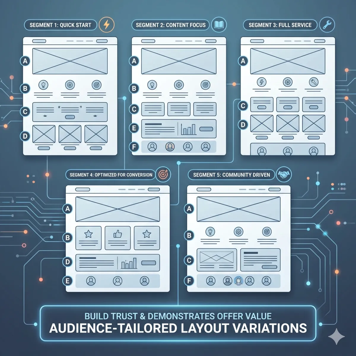
Use five wireframes that match five common psych segments: Pain-Now, Proof-Seeker, Time-Poor, Budget-Starter, Status-Chaser. Each wireframe changes where proof lives, how steps are shown, and what the CTA asks for—based on consumer behavior.
🧠 What “wireframe” means (simple)
A wireframe is a page blueprint.
It is not a fancy design.
It is the order of blocks.
Think of it like building with blocks:
block 1 goes first
block 2 goes next
and so on
When the order matches the segment’s fear and need, conversion rises.
🧩 Why page layouts are part of market segmentation
Most people do market segmentation like this:
“Here are our segments.”
Then they use the same page for every segment.
That is where things break.
Real market segmentation means:
different fear spots
different proof needs
different first steps
different CTA size
So page layout must change.
That’s how a buyer persona feels “seen” on the page.
🧠 The 5 psych segments we’re building templates for
We’ll use five common segments:
⚡ Pain-Now (Urgent Fixers)
🧾 Proof-Seeker (Needs certainty)
⏳ Time-Poor (Low time, low patience)
💰 Budget-Starter (Value + safety)
🏆 Status-Chaser (Identity + growth)
Each gets a wireframe you can copy.
🧭 The rule before the templates (one page, one slice, one CTA)
To avoid mush, follow this rule:
one page per slice
one main CTA per page
one “next step” per page
If you try to speak to 3 slices on one page, the page gets generic.
Generic pages don’t convert.
🧰 The blocks we will use (the page parts)
Every template uses the same blocks, just reordered.
🪧 Hero block
headline
“For…” line (target audience)
short promise
CTA button
🧭 Steps block
3 steps
time tags (5/10/15 min) when needed
⭐ Proof block
mini-case
reviews
stars (only if real)
timeline
❓ FAQ block
top fears and objections
short answers
🔘 CTA block
button
micro-copy (“what happens next”)
risk reducers
Now let’s build the five wireframes.
⚡ Wireframe 1: Pain-Now Page (Urgent Fixers)
Pain-Now buyers are in a rush.
They want relief.
They don’t want a long story.
🧠 What this buyer persona feels
“Fix this now.”
“I can’t wait.”
“Don’t waste my time.”
🧱 Best layout for Pain-Now (wireframe)
Hero: urgent promise
CTA + what happens next
Speed proof (reviews about speed)
Fast steps (3 steps, short)
Pricing/booking clarity
FAQ (risk reducers)
Final CTA
🪧 Hero copy (Pain-Now)
Headline: “Get ___ fixed this week (without surprises).”
For line: “For [target audience] who need ___ now.”
Subhead: “Fast start. Clear steps. No guessing.”
🔘 CTA (Pain-Now)
Use a direct CTA:
“Book now”
“Start today”
“Get help this week”
🧾 “What happens next” (Pain-Now) — put under the CTA
“After you click:
we confirm details
we start step one
you get your first win fast”
⭐ Proof placement (Pain-Now)
Put proof right next to the first CTA.
Use 1–3 short lines like:
“Fast response and clear steps.”
“No surprises. We knew what to do next.”
🧭 Steps block (Pain-Now)
Keep steps short:
Step 1: confirm details
Step 2: first action
Step 3: finish the core fix
❓ FAQ (Pain-Now)
Answer speed + cost fear:
“How soon can we start?”
“What does it cost?”
“What if we need help fast?”
✅ Why this layout converts (consumer behavior)
Pain-Now buyers click fast.
So we put the safety answers near the first click.
🧾 Wireframe 2: Proof-Seeker Page (Needs certainty)
Proof-Seekers are careful.
They compare.
They need “like-me” proof.
🧠 What this buyer persona feels
“Show me examples.”
“Will this work for us?”
“I don’t want to be fooled.”
🧱 Best layout for Proof-Seeker (wireframe)
Hero: outcome + for line
Proof-first strip (above the fold)
Mini-case (like-me)
CTA (safe step)
How it works (steps)
Proof near pricing/plan
FAQ (objections)
Final CTA
🪧 Hero copy (Proof-Seeker)
Headline: “Get ___ without guessing.”
For line: “For [target audience] who want proof before they decide.”
⭐ Proof-first strip (right under headline)
Add 3 bullets:
“Clear steps”
“Like-me examples”
“First win plan”
(Only say what you can deliver.)
📖 Mini-case (Proof-Seeker)
Use a tiny story:
“A [role] was stuck with ___.
They tried ___.
In week one, they got ___.”
🔘 CTA (Proof-Seeker)
Use a proof step CTA:
“See examples”
“Get the proof pack”
“Start the trial”
🧭 Steps block (Proof-Seeker)
They want the path:
Step 1: start small
Step 2: first win
Step 3: scale safely
❓ FAQ (Proof-Seeker)
Answer trust fears:
“Will this work for someone like us?”
“What if we tried this before?”
“What proof do we get first?”
✅ Why this layout converts (consumer behavior)
Proof-Seekers scroll for evidence.
So proof must show early and near pricing.
⏳ Wireframe 3: Time-Poor Page (Low time, low patience)
Time-Poor buyers scan.
They hate long pages.
They want quick steps.
🧠 What this buyer persona feels
“I don’t have time.”
“Make it simple.”
“I will quit if this is confusing.”
🧱 Best layout for Time-Poor (wireframe)
Hero: simple promise + time tag
3 steps with time tags
CTA (small safe step)
Proof beside steps
Tiny FAQ (4 questions only)
Final CTA
🪧 Hero copy (Time-Poor)
Headline: “A simple plan you can start today.”
For line: “For [target audience] who want ___ without spending hours.”
Subhead: “3 steps. Small wins. No big leap.”
🧭 Steps with time tags (Time-Poor)
Step 1 (5 min): do the first setup
Step 2 (10 min): take one action
Step 3 (15 min): get the first win
⭐ Proof beside steps (Time-Poor)
Place 1 proof line beside each step:
“Easy setup.”
“Clear steps.”
“Support if stuck.”
🔘 CTA (Time-Poor)
Use a small step CTA:
“See the steps”
“Get the simple plan”
“Start small”
Add micro-copy:
“Takes 2 minutes.”
❓ FAQ (Time-Poor)
Keep it short:
“How long does this take?”
“What happens first?”
“Is this hard?”
“Can we get help?”
✅ Why this layout converts (consumer behavior)
Time-Poor buyers drop off fast.
So we put steps and time tags early.
💰 Wireframe 4: Budget-Starter Page (Value + safety)
Budget-Starters fear wasting money.
They need value clarity.
They want to start small.
🧠 What this buyer persona feels
“Is this worth it?”
“What if I waste money?”
“Can I start small?”
🧱 Best layout for Budget-Starter (wireframe)
Hero: start-small promise
Value bullets (what you get)
CTA (small step)
Proof near CTA (value proof)
Pricing guidance (good/better/best)
FAQ (refund/fit/time)
Final CTA
🪧 Hero copy (Budget-Starter)
Headline: “Start small. Get clear results.”
For line: “For [target audience] who want ___ without wasting money.”
✅ Value bullets (Budget-Starter)
Add 5 bullets:
“What you get right away”
“What happens in week one”
“What support looks like”
“What you don’t need to do”
“Who it’s for / not for”
🔘 CTA (Budget-Starter)
Use:
“Get the complimentary guide”
“See what’s included”
“Start the starter plan”
⭐ Proof placement (Budget-Starter)
Put proof near the CTA that mentions value:
“Clear steps and no fluff.”
“We knew what we were paying for.”
💵 Pricing guidance (Budget-Starter)
Use plan labels (only if true):
Starter (best for…)
Pro (best for…)
Urgent (best for…)
And add a simple line:
“If you want to start safe, start with Starter.”
❓ FAQ (Budget-Starter)
Answer money fear:
“What do we get?”
“What if it’s not a fit?”
“Do we need a contract?” (only if relevant)
“How fast is the first win?”
✅ Why this layout converts (consumer behavior)
Budget buyers click pricing and FAQs.
So value and risk reducers must be near pricing and CTA.
🏆 Wireframe 5: Status-Chaser Page (Identity + growth)
Status-Chasers want to level up.
They care about outcomes and identity.
🧠 What this buyer persona feels
“We want the best path.”
“We want to win bigger.”
“We don’t want the basic plan.”
🧱 Best layout for Status-Chaser (wireframe)
Hero: outcome + identity
Mini-case: before/after
CTA (strategy/pro path)
Proof timeline (week 1/2/3)
Plan guidance (best for…)
FAQ (fit + next steps)
Final CTA
🪧 Hero copy (Status-Chaser)
Headline: “Build results you’re proud of.”
For line: “For [target audience] who want ___ and want to do it right.”
📖 Mini-case (Status-Chaser)
Use a clean arc:
“Before: ___
After: ___
What changed: ___”
🔘 CTA (Status-Chaser)
Use:
“Choose the pro path”
“Book a strategy call”
“See the success plan”
⭐ Proof timeline (Status-Chaser)
Week 1: first win
Week 2: momentum
Week 3: clear improvement
🧾 Plan guidance (Status-Chaser)
Add “best for” labels and outcomes (only if true):
“Best for teams who want speed.”
“Best for teams who want full support.”
❓ FAQ (Status-Chaser)
Answer fit questions:
“Is this the right plan for us?”
“What happens after we start?”
“How fast is the first win?”
“How do we measure progress?”
✅ Why this layout converts (consumer behavior)
Status buyers compare outcomes and paths.
So we lead with identity and results.
🧠 How to pick the right wireframe (fast)
Use this simple choice:
If they need help now → Pain-Now wireframe
If they need proof → Proof-Seeker wireframe
If they have no time → Time-Poor wireframe
If they fear wasting money → Budget-Starter wireframe
If they want growth/status → Status-Chaser wireframe
This is market segmentation turned into page design.
🧩 How buyer persona fits into each wireframe
Market segmentation picks the slice.
Then buyer persona makes the slice feel human.
For each wireframe, we still need buyer persona words:
pain words
dream words
doubt words
proof needed
first safe step
That’s why “buyer persona” is still the core.
Segmentation gives the map.
Buyer persona gives the language.
📍 Placement rules (hero vs CTA block)
Here are the placement rules that work almost every time:
🪧 Hero area is for:
“For…” line (target audience)
motive (what they want)
simple promise
🔘 CTA area is for:
risk reducers
proof
micro-FAQ
“what happens next”
Fear spikes at the click.
So answers must be near the click.
🧪 How to test wireframes (one-change-one-week)
Don’t rebuild everything.
Test one change per week:
move proof by CTA
move steps above proof
change CTA step size (guide vs call)
swap FAQ order (top fear first)
Track consumer behavior:
CTR
bounce
time
CTA clicks
conversions
Let behavior pick the winner.
❓ FAQ — Page Templates for Market Segmentation
1) What is a page wireframe for market segmentation?
A wireframe is the order of page blocks (hero, steps, proof, FAQs, CTA) designed to match a market segmentation slice.
2) Why do different segments need different page layouts?
Different segments feel risk in different places. Consumer behavior changes, so proof and CTAs must move to match the brain.
3) Which wireframe works best for urgent buyers?
The Pain-Now wireframe works best because it puts the CTA and “what happens next” near the top with speed proof.
4) Which wireframe works best for proof seekers?
The Proof-Seeker wireframe works best because it leads with proof early and adds proof again near pricing and the CTA.
5) Which wireframe works best for time-poor buyers?
The Time-Poor wireframe works best because it puts 3 simple steps with time tags early and keeps the page short.
6) Which wireframe works best for budget starters?
The Budget-Starter wireframe works best because it shows value bullets, start-small options, and risk reducers near pricing.
7) Which wireframe works best for status chasers?
The Status-Chaser wireframe works best because it leads with outcomes, identity, and a clear “pro path” choice.
8) How does buyer persona fit into these wireframes?
Buyer persona provides the exact words for pain, doubts, and proof needed. The wireframe decides where those words live.
9) Do we need one page per segment?
Yes, when possible. One page per slice keeps messaging clear and makes testing easier.
10) What is the fastest improvement for most pages?
Move proof next to the first CTA and add 4–6 micro-FAQs under the CTA to reduce risk at the click.
11) How do we test page layouts without guessing?
Use one-change-one-week tests. Track bounce, time, CTA clicks, and conversions by segment.
12) How many segments should we build pages for first?
Start with 3 segments. Build winners first. Add more later.
📌 Key Takeaways
Market segmentation changes page layout, not just labels
Use 5 wireframes: Pain-Now, Proof-Seeker, Time-Poor, Budget-Starter, Status-Chaser
Keep one page per slice with one main CTA
Put motive in the hero and risk reducers near the CTA
Buyer persona words make each segment feel human and real
Test one change per week using consumer behavior KPIs
This is buyer clarity inside The Buyer Clarity System™
🎁 Complimentary Ebook
Want these five wireframes as a one-page printable?
Grab our COMPLIMENTARY Buyer Clarity Guide here:
👉 Download your complimentary ebook now
🧭 Final Word
Pages don’t convert because they are pretty.
Pages convert because they match the brain.
Pick the segment. Use the wireframe. Add buyer persona words. Put proof where fear lives.
That’s how market segmentation becomes sales—inside The Buyer Clarity System™.
