🧱 Buyer Persona Landing Page Template (Copy, Layout, and CTA)
🧱 Buyer Persona Landing Page Template (Copy, Layout, and CTA)
A landing page should feel like a mirror.
Not a brochure.
Not a “we do everything” page.
A mirror.
Because the buyer’s brain is doing one job when they land:
“Is this for me… and is it safe?”
If the answer is unclear, they leave.
That shows up in consumer behavior:
bounce is high
time on page is low
CTAs don’t get clicked
sales feel slow
So we don’t start with design.
We start with the buyer persona.
Then we build a page that matches the persona’s:
pain
dream
moment
doubts
proof needed
safe next step
A buyer persona landing page uses one “For…” line, one pain-first headline, proof near the CTA, a 3-step path, micro-FAQs under the CTA, and a single stage-matched CTA. Build it mobile-first and test one change per week.
🧠 What a buyer persona landing page is (simple)
A buyer persona landing page is:
A page designed for one specific buyer type, with one specific next step.
It does not try to convince everyone.
It helps the right person self-select fast.
🎯 The “one page, one persona, one CTA” rule
This rule keeps the page sharp:
one buyer persona
one promise
one CTA
If we break this rule, the page gets generic.
Generic pages don’t convert.
🧩 Step 1: Pull the buyer persona “core lines”
Before we write the page, we pull six persona lines.
✅ Buyer persona core lines (copy/paste)
“For…” line (target audience): ____
Pain line: “We’re stuck with ____.”
Dream line: “We want ____.”
Moment line: “We need this because ____.”
Doubt line: “We worry ____.”
Proof needed line: “We need to see ____.”
Now the page writes itself.
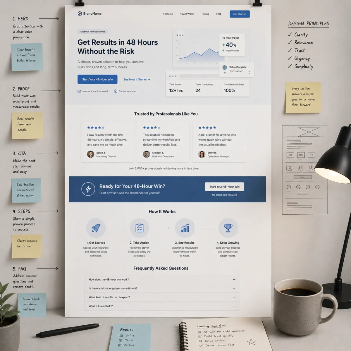
🧱 The wireframe (template you can copy)
Here is the exact landing page wireframe.
✅ Buyer Persona Landing Page Wireframe
Hero: headline + For line + CTA
Proof near CTA (tiny)
Steps: 3-step path (with time tags)
Persona mirror block (pain/dream/doubt/proof)
Proof stack (bigger proof)
Micro-FAQ under CTA (4–8 objections)
Final CTA + “what happens next”
We’ll break down each block.
1) 🪧 Hero Block (headline + “For…” line + CTA)
The hero is the first screen.
It must answer two questions fast:
“Is this for me?”
“What do I do next?”
✅ Headline formulas (buyer persona)
Formula A (pain + dream):
“Stop [pain] and get [dream] without [fear].”
Formula B (moment):
“If you need [result] by [date], start here.”
Formula C (proof):
“See how people like you got [result] (simple steps).”
✅ “For…” line (target audience)
Use this under the headline:
“For [group] who want [result] without [pain] in [time].”
✅ Hero CTA (stage-based)
Pick one CTA:
Cold: “Get the complimentary guide”
Warm: “Start the trial” / “Book a quick demo”
Hot: “Book now” / “Start now”
✅ Hero micro-copy (under CTA)
“Start small. Takes 2 minutes. No big leap.”
That line reduces risk.
2) ⭐ Proof Near the Button (tiny proof)
Most pages bury proof.
But fear spikes at the click.
So proof lives near the CTA.
✅ What counts as “tiny proof”
1–3 short review lines (real)
short credibility line (“Clear steps. Simple support.”)
mini case line (“First win in 48 hours.” if true)
simple “what happens next” (reduces risk)
✅ Tiny proof block (copy/paste)
“Most buyers start with step one today.
First win comes fast with clear steps and support.”
(Only claim what you can deliver.)
3) 🧭 Steps Block (3 steps with time tags)
Steps reduce effort fear.
They tell the buyer:
“This is not a mystery.”
✅ Steps template (copy/paste)
Step 1 (5 min): ____
Step 2 (10 min): ____
Step 3 (15 min): ____
“First win in 48 hours.”
Time tags help Time-Poor buyers especially.
4) 🪞 Persona Mirror Block (make them feel seen)
This is where the page becomes a mirror.
✅ Persona mirror block (copy/paste)
“We’re stuck with [pain].
We want [dream].
We tried [past try], and it didn’t work.
We worry [doubt].
We need [proof] to feel safe.”
Short. Honest. Powerful.
5) 📌 Proof Stack (bigger proof that matches the persona)
Now we expand proof.
Proof must match the buyer persona.
✅ Proof types (choose 1–2)
mini case story (3–6 lines)
real review quotes
“what changed in week one” timeline
screenshots (only if true)
✅ Mini case template (copy/paste)
“Before: [pain].
After: [win].
What changed: [simple action].
Time: [week one win].”
Keep it simple.
6) ❓ Micro-FAQ Under the CTA (objections)
This is where conversion often happens.
Because the buyer is asking:
“What could go wrong?”
Answer it calmly.
✅ Micro-FAQ rules
4–8 questions
short answers (1–3 lines)
use buyer words
place under CTA
✅ Micro-FAQ question bank (choose 6)
“Will this work for someone like us?”
“What happens first?”
“How fast is the first win?”
“How much time does this take?”
“What if we tried something else before?”
“Is this hard to set up?”
“What if we get stuck?”
“Is this a contract?” (only if relevant)
7) 🔘 Final CTA + “What Happens Next” Block
The bottom CTA is for buyers who needed proof.
Use the same CTA as the top.
Consistency reduces friction.
✅ “What happens next” block (copy/paste)
“After you click:
You get step one
We guide the first win
You see progress fast”
This reduces fear.
📱 Mobile checklist (don’t skip this)
Most traffic is mobile.
A page can be “good” on desktop and still fail.
✅ Mobile checklist
headline fits on 2–3 lines
CTA button is full width
proof is above the fold
steps are bullets (not paragraphs)
FAQs are short
no tiny fonts
fast load speed
form fields are minimal
Mobile clarity = more conversions.
🧪 How to test your buyer persona landing page (clean tests)
Don’t change everything.
One change per week.
✅ High-impact A/B tests
headline: pain vs proof
proof: near CTA vs lower
CTA: guide vs call (step size)
add micro-FAQ under CTA vs none
add 48-hour win block vs none
Track consumer behavior:
bounce
time on page
CTA clicks
conversions
lead quality
Let behavior pick winners.
🧯 Common mistakes (and quick fixes)
Mistake: page is “for everyone”
Fix: add a sharp “For…” line and remove extra audiences.
Mistake: proof is buried
Fix: move proof next to the CTA.
Mistake: CTA is too big
Fix: make the first step smaller (guide/audit).
Mistake: steps are unclear
Fix: add a 3-step path with time tags.
Mistake: FAQ is missing or fluffy
Fix: use real objections from emails, DMs, and calls.
🧠 Why this supports ranking for “buyer persona”
This post supports SEO for buyer persona because it:
defines buyer persona clearly
shows how buyer persona becomes a page
uses the keyword naturally in headings and templates
includes AEO-friendly FAQs around buyer persona landing pages
That builds authority across search engines and AI answer engines.
❓ FAQ — Buyer Persona Landing Page Template
1) What is a buyer persona landing page?
It is a landing page designed for one buyer persona, with one promise and one clear CTA that matches their stage.
2) What should be in the hero for a buyer persona page?
A pain/dream headline, a “For…” line for the target audience, one CTA, and tiny proof near the button.
3) Where should proof go on a landing page?
Proof should be near the CTA and near pricing because fear spikes at the click.
4) What is the best number of steps to show?
Three steps is best for clarity. Add time tags if your buyer persona fears effort or confusion.
5) What should go in micro-FAQs under the CTA?
The top buyer persona objections in buyer words: fit, time, speed, risk, setup, and what happens next.
6) How do we pick the right CTA for the buyer persona stage?
Cold buyers need a small step (complimentary guide). Warm buyers fit trial/demo. Hot buyers fit book/buy.
7) What makes a buyer persona page feel like a mirror?
Using real buyer words for pain, doubts, and proof needed—plus showing a clear first win.
8) How do we make landing pages mobile-friendly?
Use short headings, full-width buttons, proof above the fold, bullet steps, short FAQs, and minimal form fields.
9) How do we test a buyer persona landing page?
Run one change per week: headline, proof placement, CTA wording, micro-FAQ, or 48-hour win block.
10) What is the biggest landing page mistake?
Trying to speak to too many people at once. One buyer persona per page converts best.
11) How does this connect to target audience and market segmentation?
Market segmentation picks the slice, target audience names the group, and the buyer persona shapes the copy and CTA.
12) What should we do after the landing page converts?
Build a second page for the next slice and link them in a content hub. Scale slowly with clean data.
📌 Key Takeaways
A buyer persona landing page is built for one persona and one CTA
Use a wireframe: hero → proof by CTA → steps → mirror block → proof → FAQs → CTA
Put proof and objections near the button because fear spikes at the click
Use mobile-first rules: full-width buttons, short blocks, fast load
Test one change per week using consumer behavior metrics
This is buyer clarity inside The Buyer Clarity System™
🎁 Complimentary Ebook
Want the full landing page wireframe, headline swipe file, and micro-FAQ templates?
Grab our COMPLIMENTARY Buyer Clarity Guide here:
👉 Download your complimentary ebook now
🧭 Final Word
A landing page doesn’t need more words.
It needs the right words in the right order.
Start with the buyer persona. Mirror their pain. Place proof by the click. Make the next step feel safe.
That’s how pages convert—inside The Buyer Clarity System™.
